For this project, I took the feeling of an unrequited crush, and translated it into four designs, ranging from almost entirely verbal, to almost entirely visual.

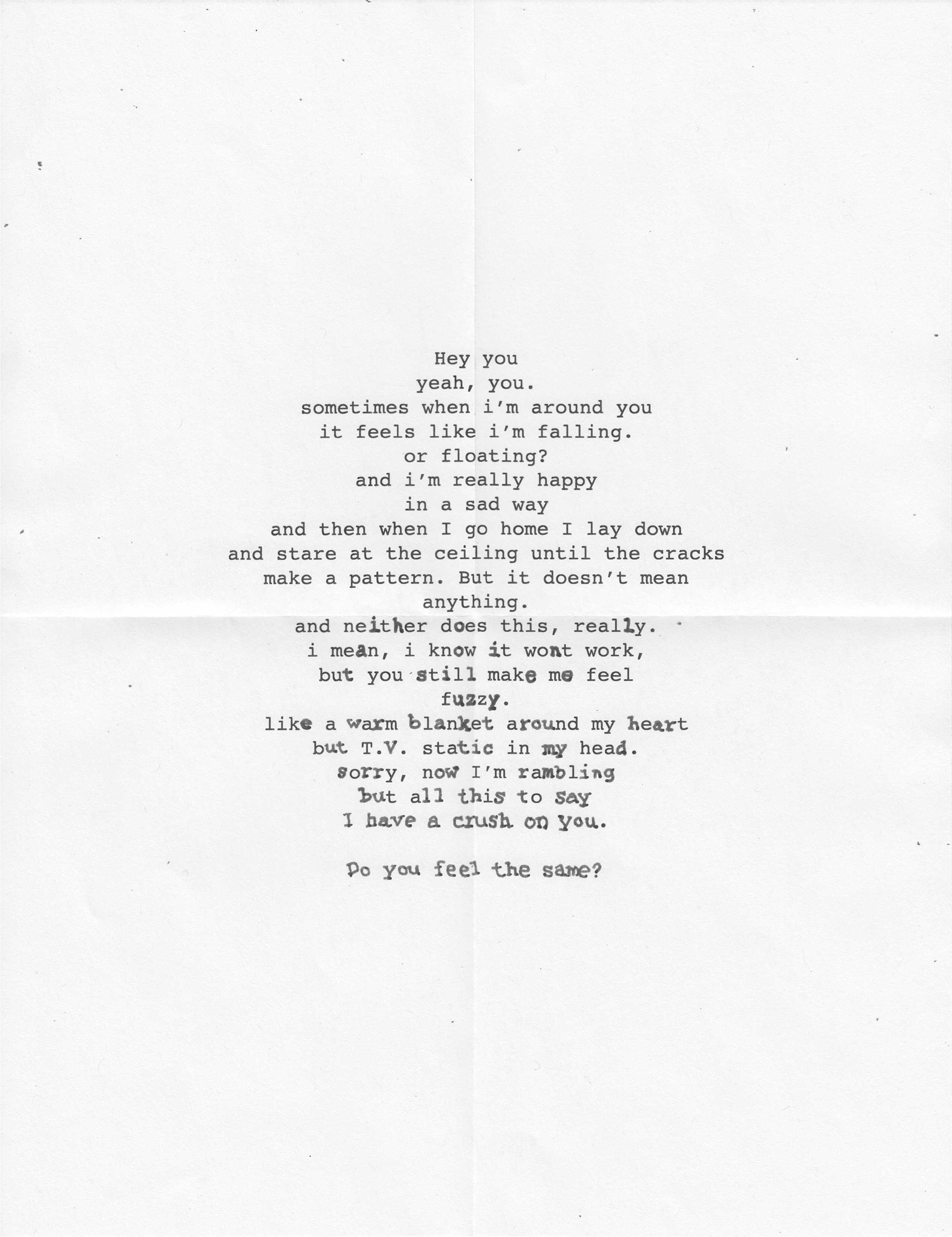
The first design, almost entirely verbal with subtle visual context. The use of Courier invokes a historical, nostalgic feeling that is closely associated with having a crush. The type giving way to handwriting, combined with the subtle folds in the paper are reminiscent of a handwritten note.
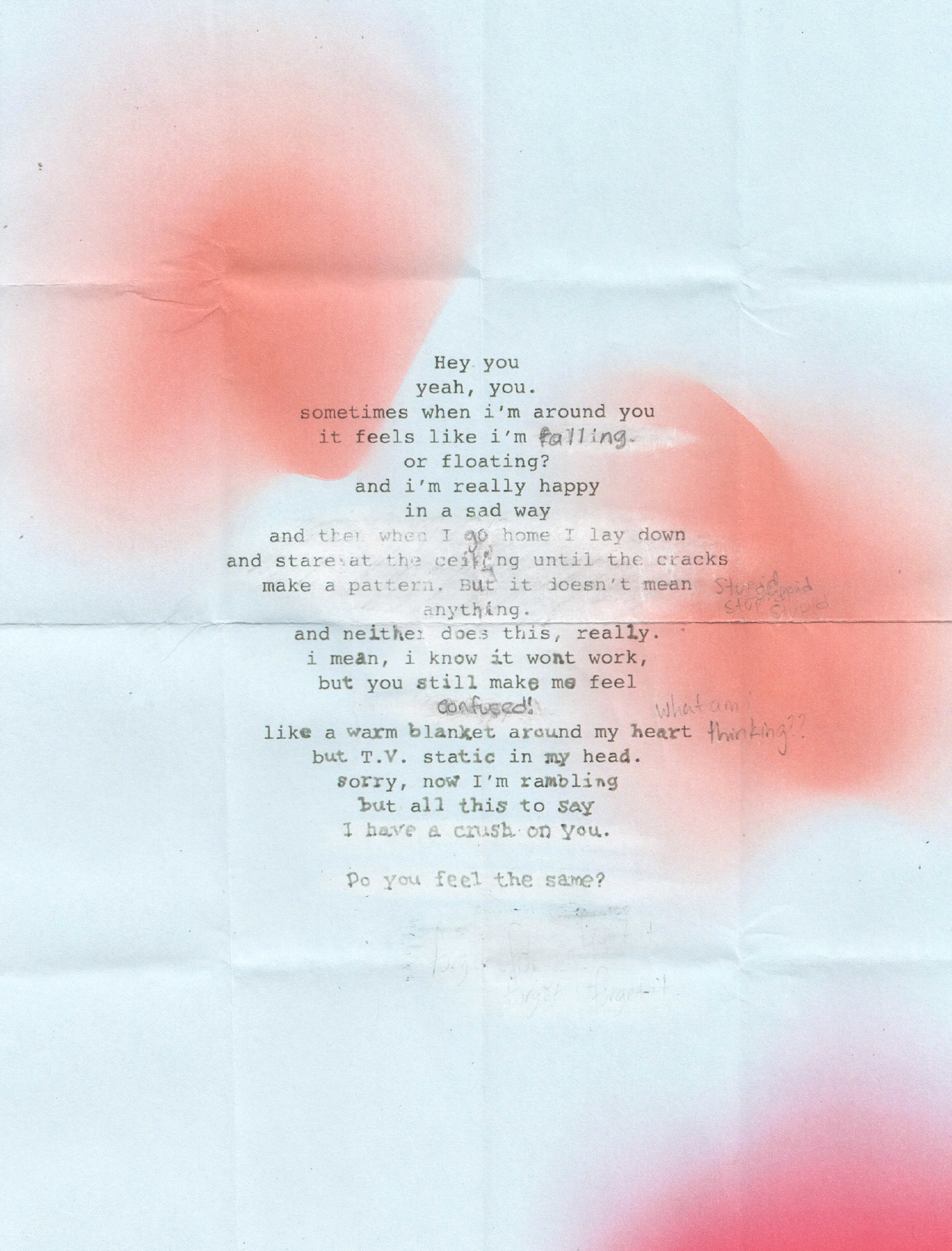
The second piece is designed with more visual context, while still remaining primarily verbal. The text is read first, and it is all legible. The handwritten aspects of the type are done more freehand to lend itself even more to the idea of a handwritten note. Many of the lines have been partially erased, this is meant to indicate to the viewer that feeling of wanting to say something, and then backtracking that is associated with a new crush. A gradient mesh was added to the background with colors that speak to the emotions associated with a crush, gentle pinks and blues.
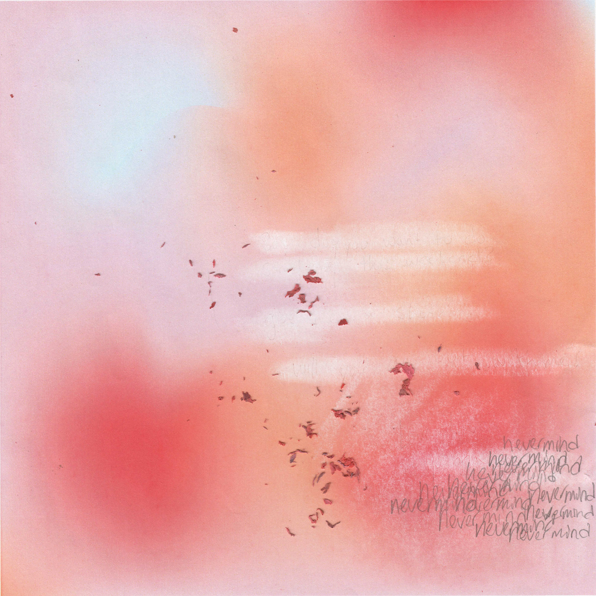
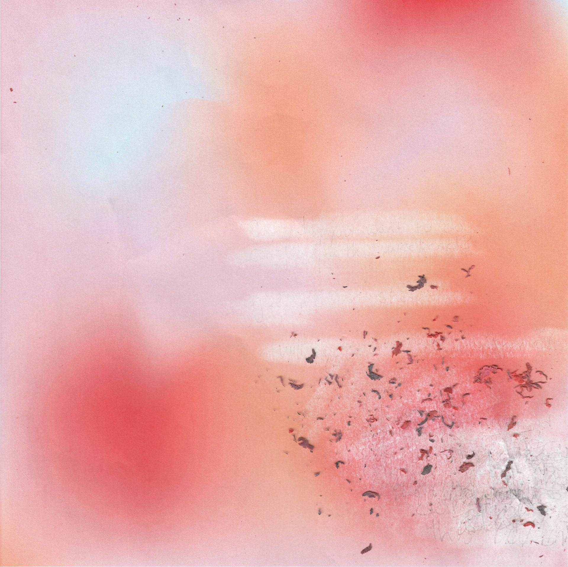
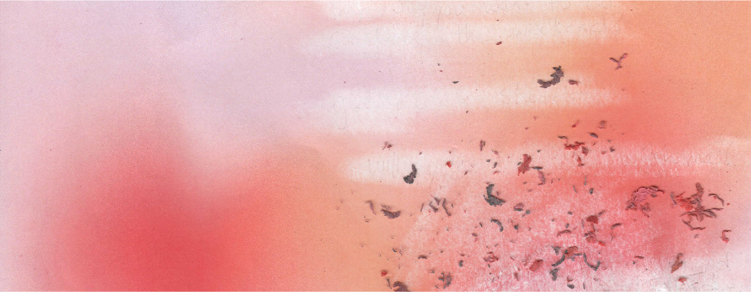
In the third design, I changed the dimensions of the design to be square. This design is mostly visual now, using a gradient mesh with soft warm colors and the motif of eraser marks/shavings in lieu of legible typography to convey the idea of a crush. Handwriting the words "never mind" over and over again indicates the doubt that comes with an unrequited crush, without being too obvious about the intent of the design.
The last design is entirely visual, with no legible handwriting anywhere. The eraser marks are so heavy that they almost break through the paper, which speaks to the feeling of being worn thin by the melancholy of an interest that isn't returned. The marks and large amounts of shavings also indicate something that was written, erased, and rewritten many times. This visual representation of doubt and uncertainty speaks to the feeling of a crush in a unique way that effectively conveys my message in a visually engaging fashion.