I worked with and led a small creative team to develop the visual identity for Champlain College's 2021 Visual Communication Design Senior Capstone Showcase.
Visit the Showcase!
See the Capstone Showcase for yourself by clicking on the image below.
Title
inter_ holds many meanings, which is precisely why it was chosen to be the name of the VCD Capstone show. This prefix speaks to the connections that bind us all, as well as the unparalleled times we are living in. It calls to mind not only the interdisciplinarity, interconnectivity, and intersectionality that a project like the VCD Capstone entails, but also the interference and interruptions that come with the world we live in today.
Mark
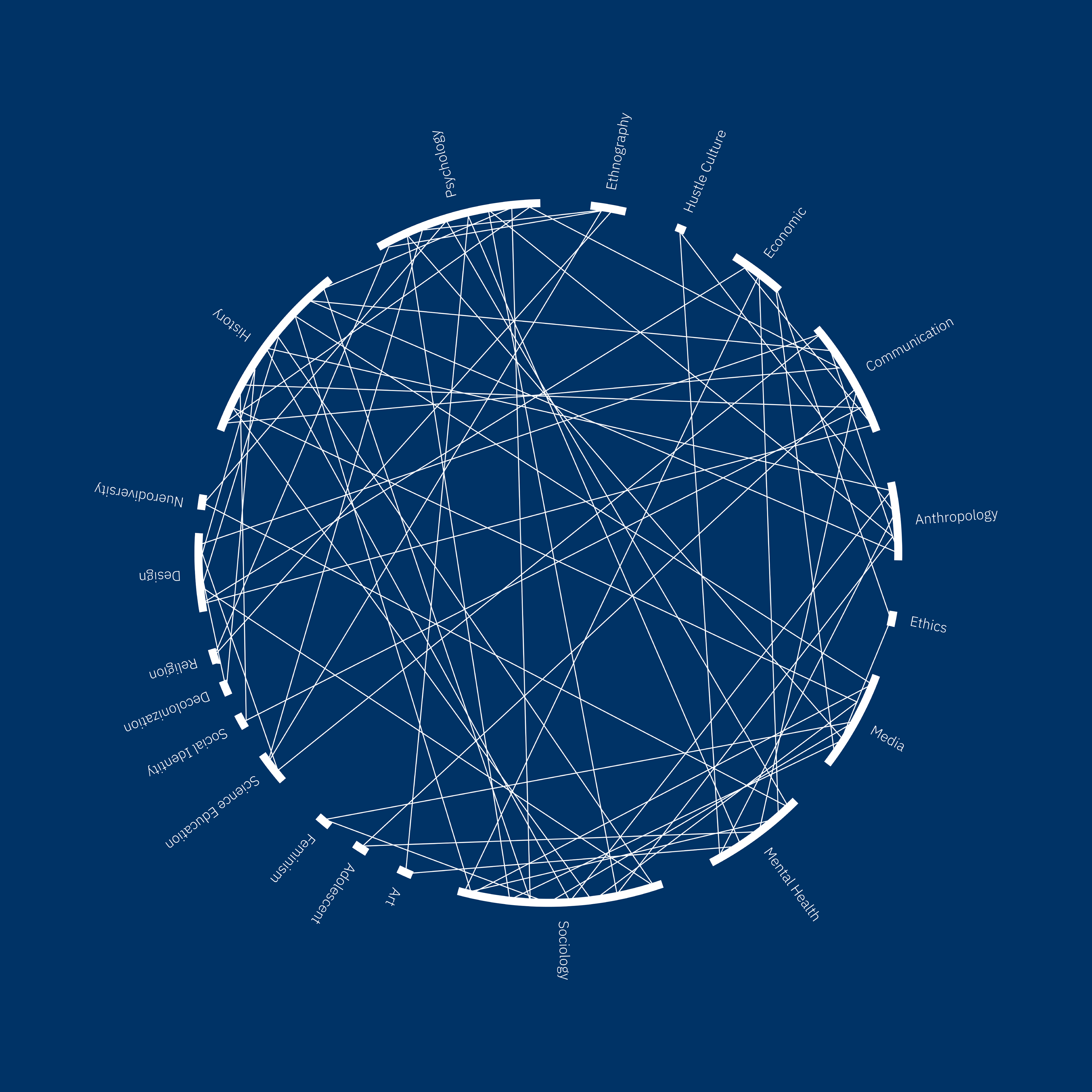
The mark needed to represent each VCD Capstone student, while still connecting conceptually to the name inter_. Originally the ideas of space and constellations were discussed, which led the group to talk about the appearance of flight paths. The design team took inspiration from Aaron Koblin’s flight path art, which came to influence the final color palette. While the team took visual inspiration from flight patterns, the mark still needed a more direct tie to the students. The solution to this problem came when the team looked at the research lenses that each student used for their projects. Each line represents a connection between three different lenses, and in turn, a student that used those lenses in their project. This led to the final mark which connects to the concept of interconnectivity and interference.
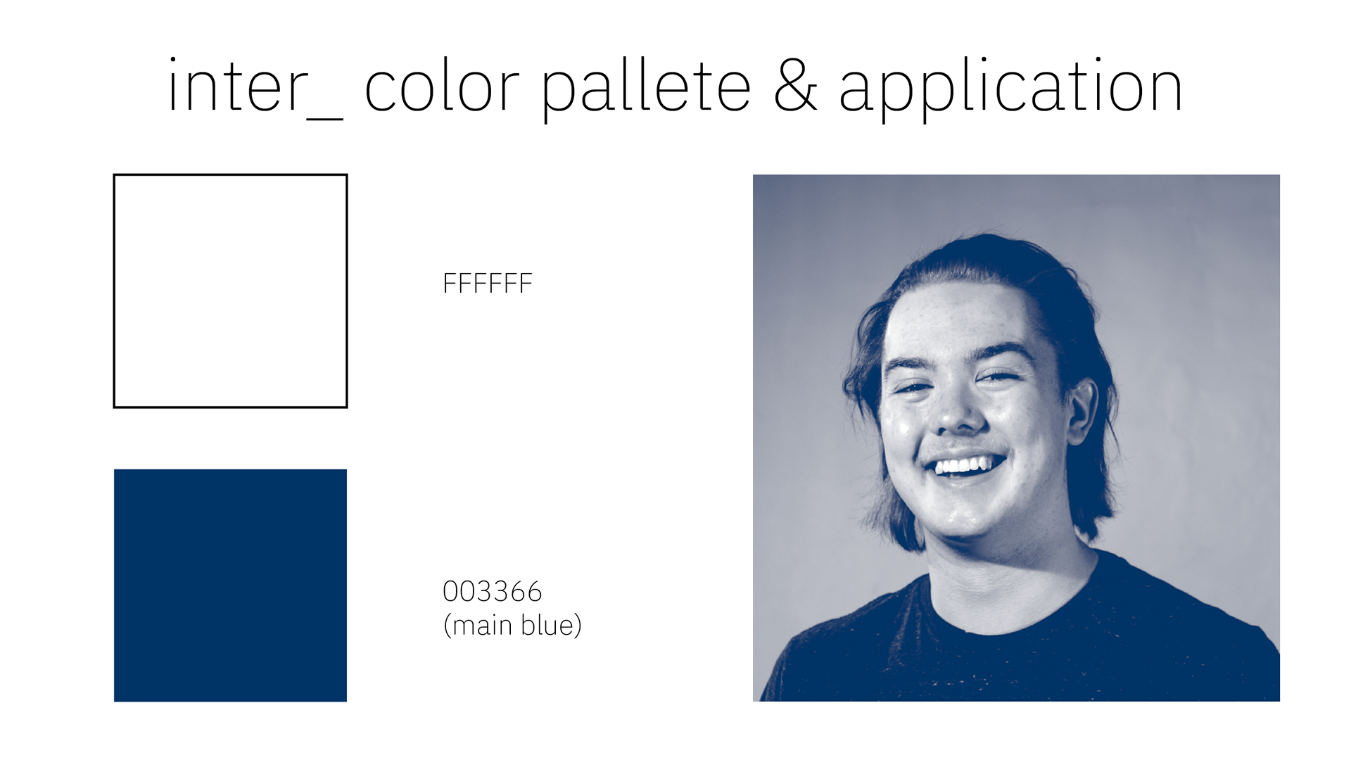
Visual Identity
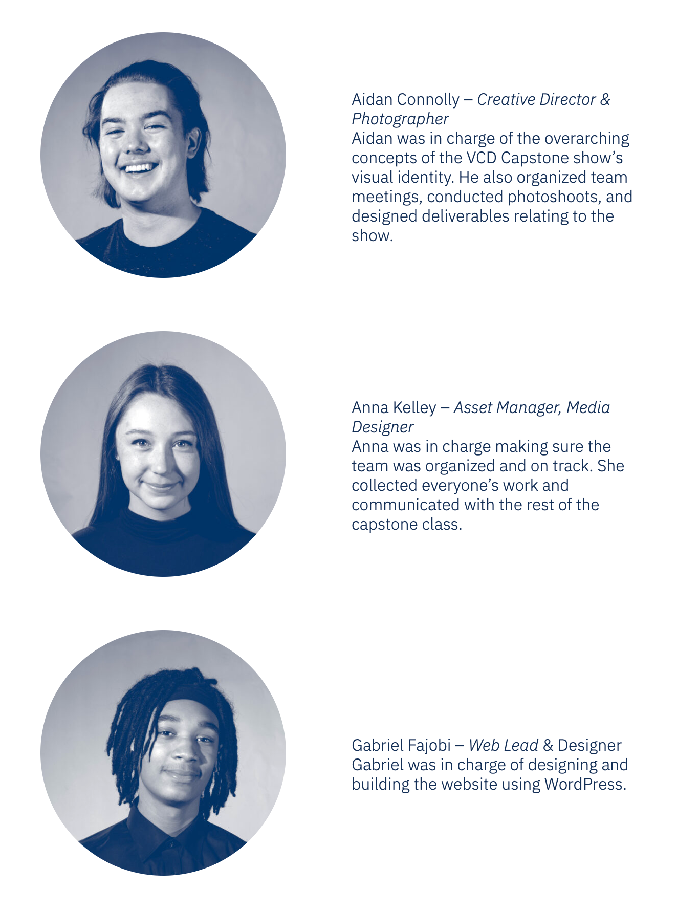
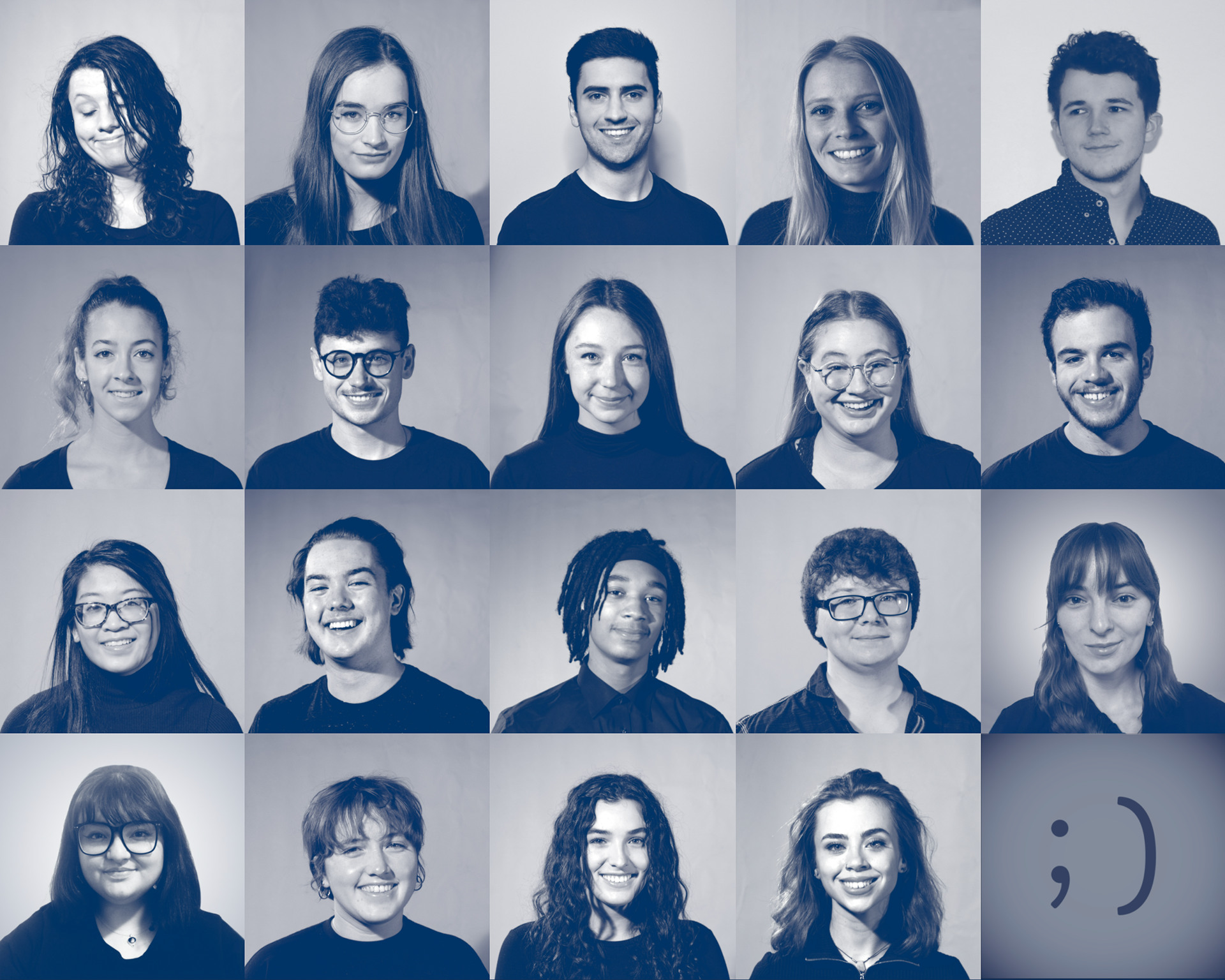
We wanted the visual identity to be distinct, while still falling to the background and elevating the work of the students. In order to accomplish this we opted to use a very limited color palette consisting of blue and white. I shot a series of portraits for each student to serve as the homepage of the website we hosted the Capstone Showcase on. I used a duotone of white and blue on each portrait to give visual consistency to the homepage.
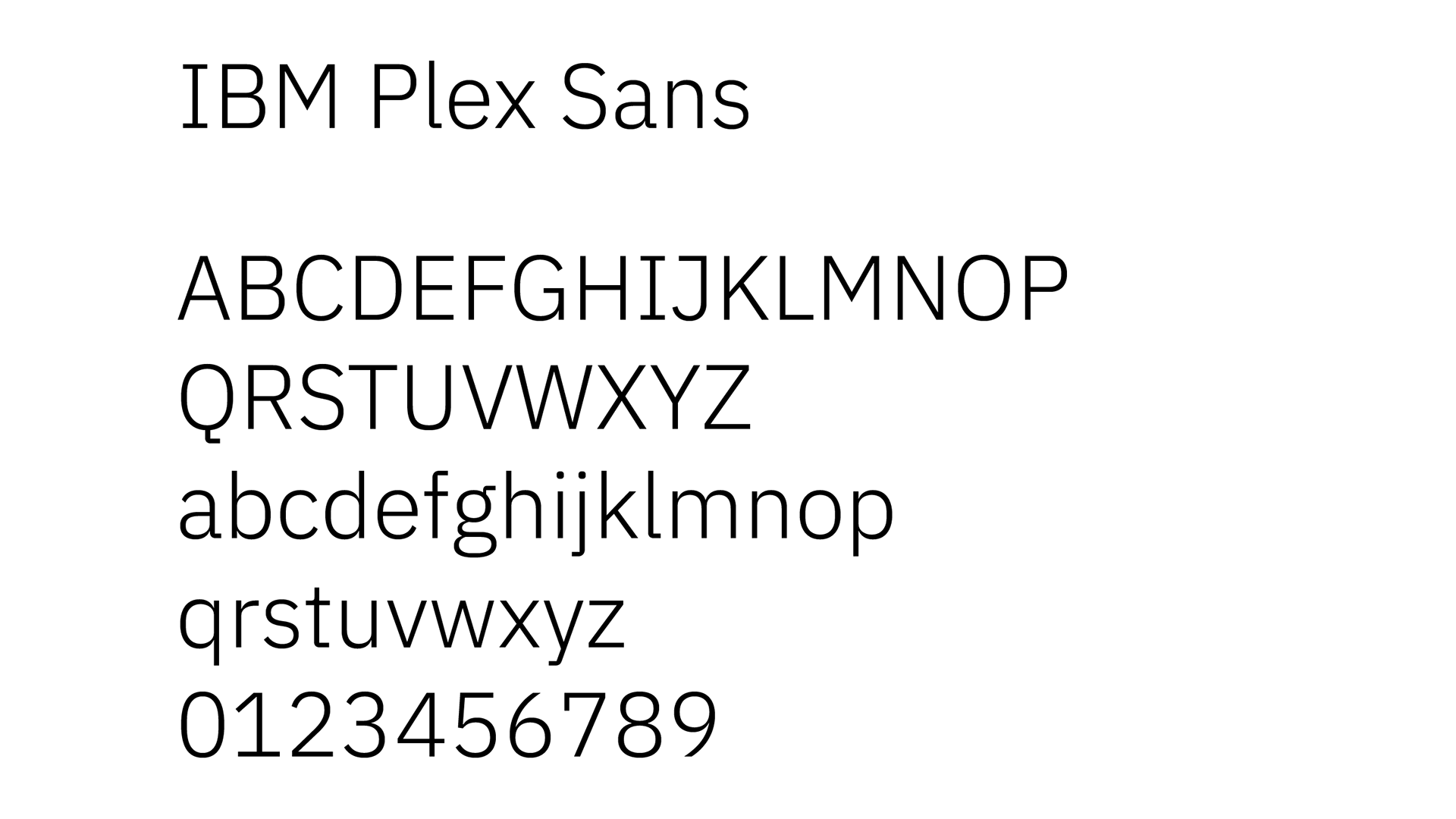
Typography
We knew that a sans serif font was the right call for the Capstone Showcase because it would allow the student work to shine while still being easily legible and concise. We tried out a variety of sans serif fonts before settling on IBM Plex Sans. Plex Sans' hard angled lines hung well with the mark we had come up with without sacrificing readability.