
GLOSS is a publication for all things on the bleeding edge of art and design. This quarterly magazine is made for anyone interested in a critical look at design and visual culture.
Sleek. Polished. Brilliant. Clear. We all like shiny things.
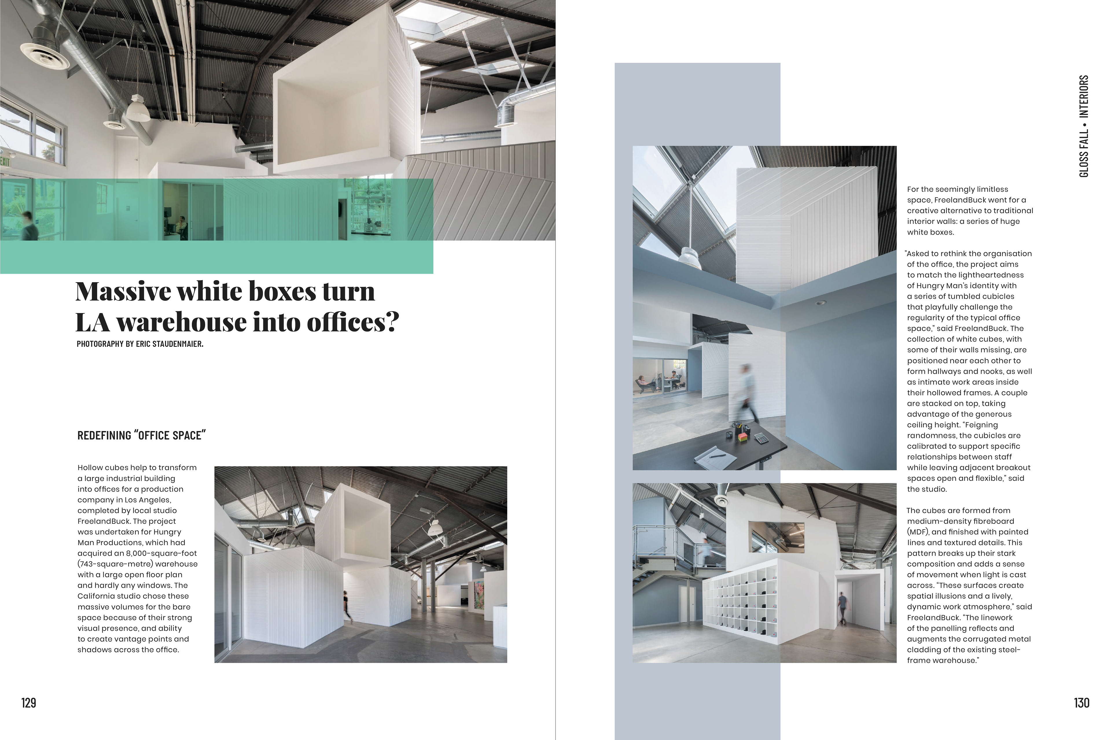
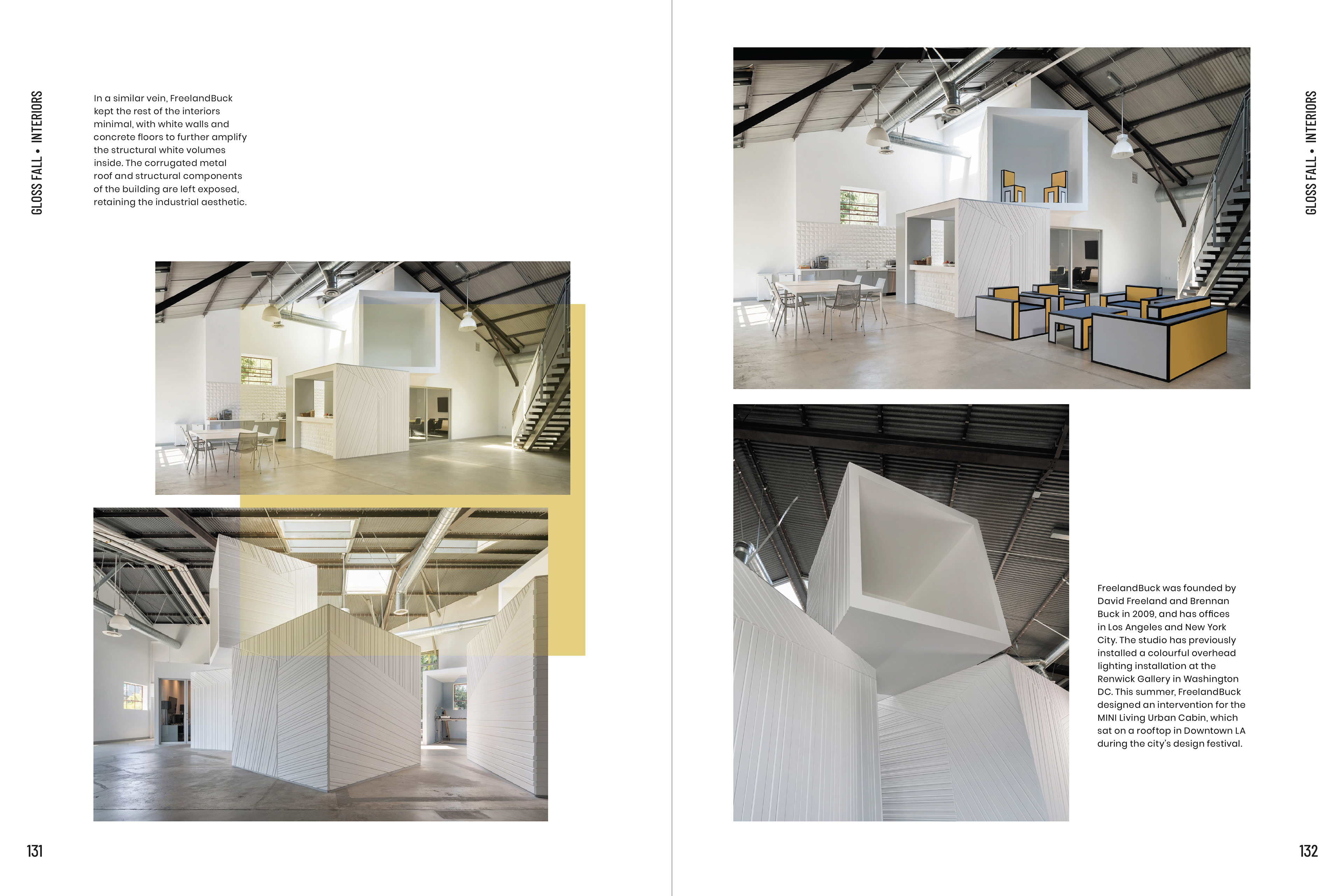
I was tasked with designing this article about a warehouse-turned-office in Los Angeles. I opted to use small blocks of text interspersed with evenly spaced, comfortably sized imagery to best communicate the feeling of the open spaces and white boxes within the warehouse. The use of three different typefaces in different weights and font sizes helps the reader quickly absorb the information, and know what to read next. The blocks of color flooding over the images help to keep the spreads from looking too sterile, injecting a bit of visual contrast to guide the reader's eyes around the page. These spreads aren't just meant for reading, they're meant for viewing too.
Working on GLOSS was not only an exercise in typographical hierarchy and publication design, but in working as a member of a larger design team. Seventeen other designers and myself created a magazine publication that was over 200 pages in length, and the end product is something that I can be proud of.