

Truss Acoustics is a guitar company aimed at providing quality products and service at an accessible price.

This project was a lesson in branding and print production for me. I built out a brand identity, as well as several print pieces for this project.
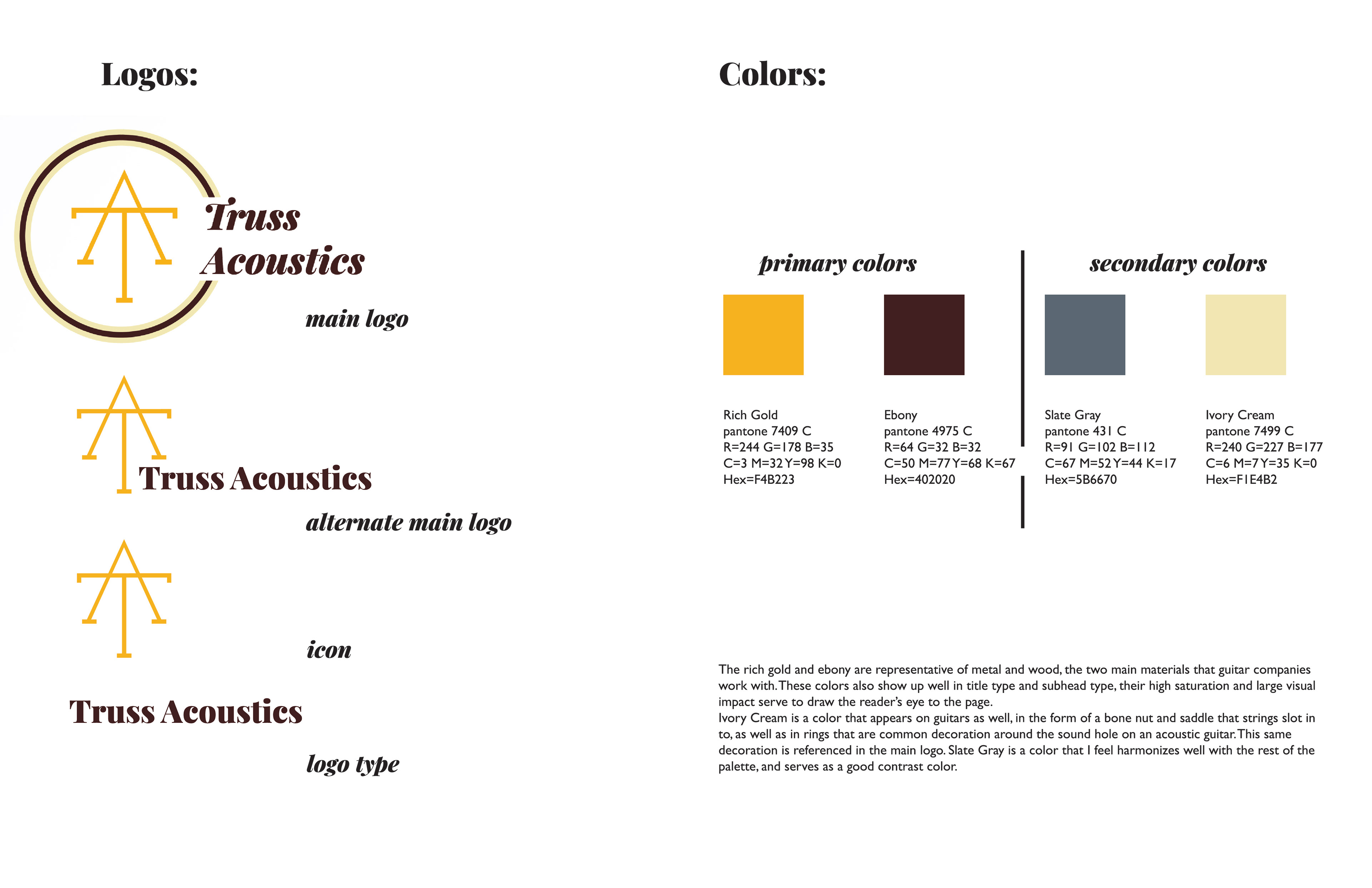
I started by building out a series of logos, starting with a main logo, and including an alternate, as well as an icon and logo type. I also specified colors for a palette that could be easily sent to a printer.
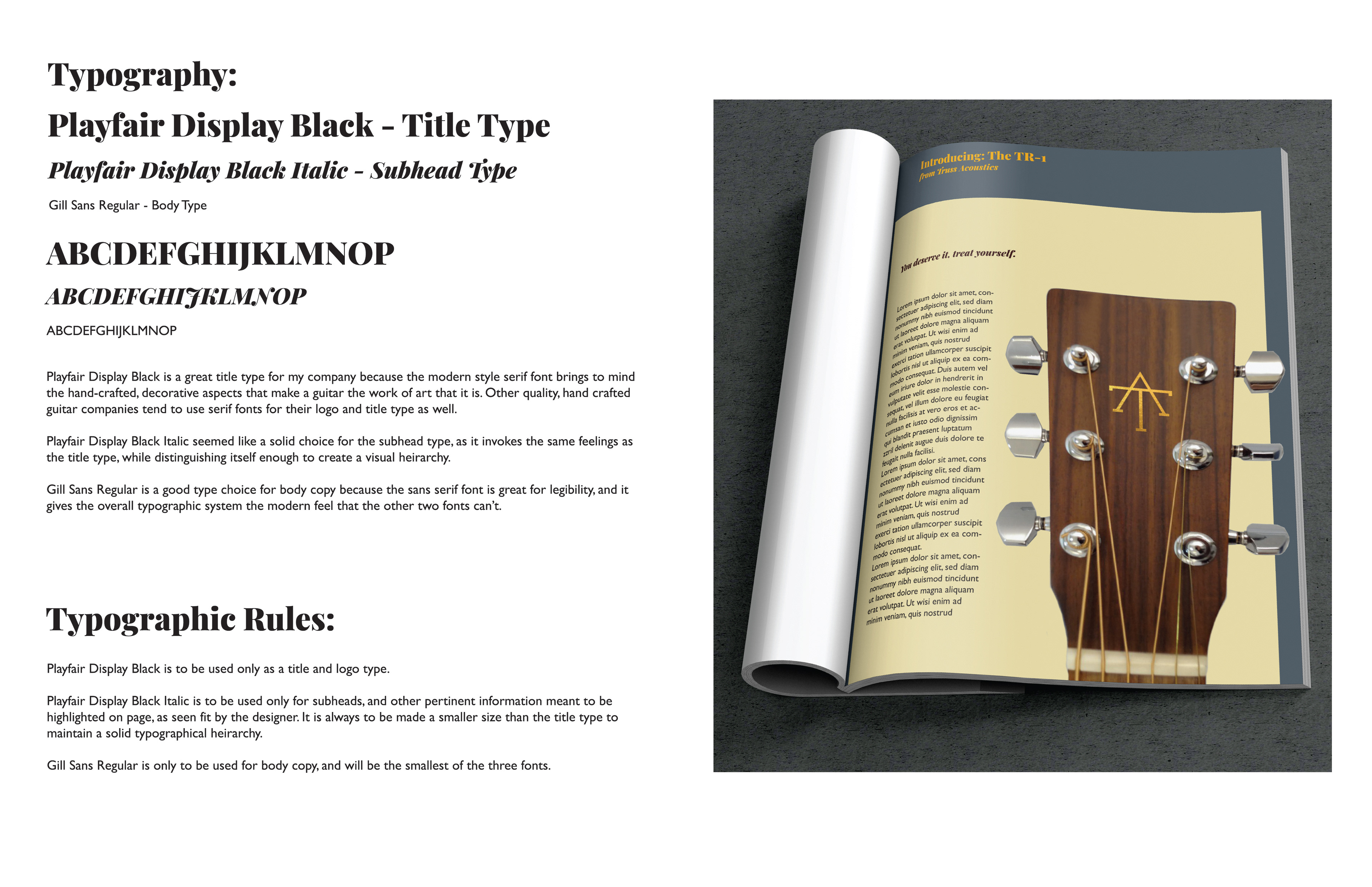
Another critical aspect of brand identity is typographic choices. I established a typographical hierarchy consisting of title type, subhead type, and body copy type. I also established rules to keep the typography visually cohesive throughout different pieces such as advertisements, postcards, and packaging.
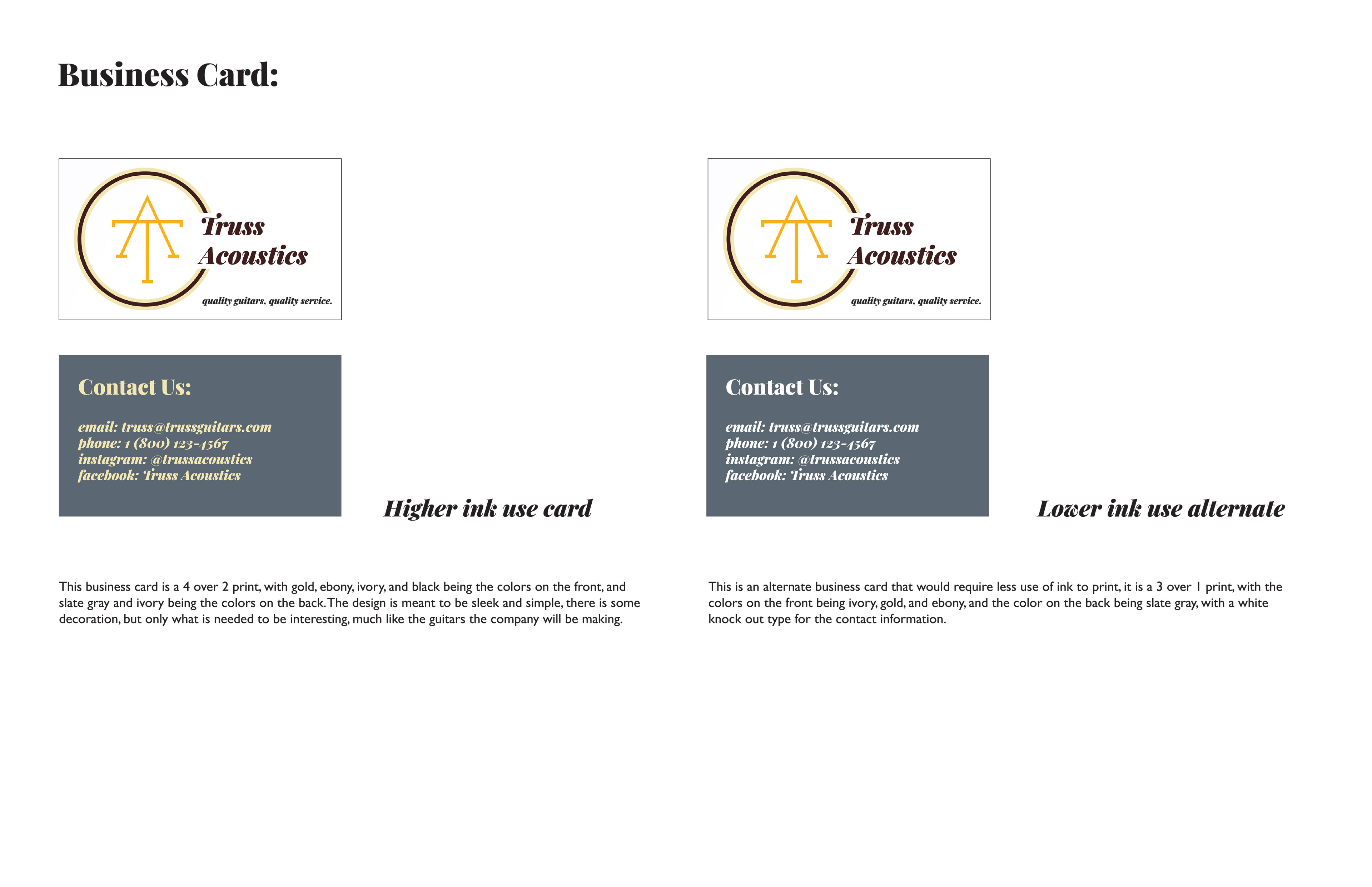
The first of my print pieces that I built out for Truss Acoustics was a business card. I made two different versions, one of which was a higher ink use version that made use of more of the colors in my palette, while the other option was a lower ink use version that opted for knockout white type to cut printing costs.
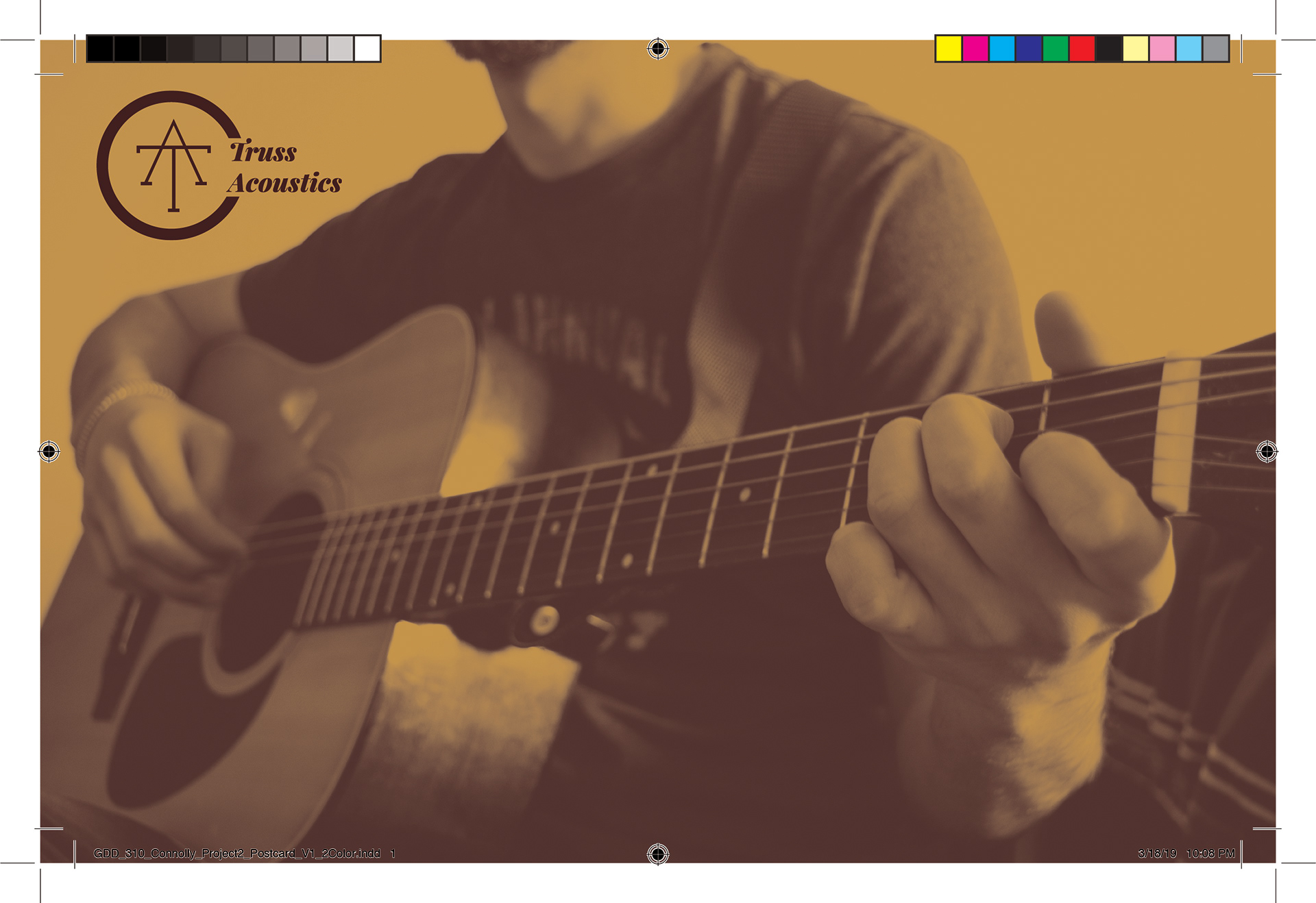
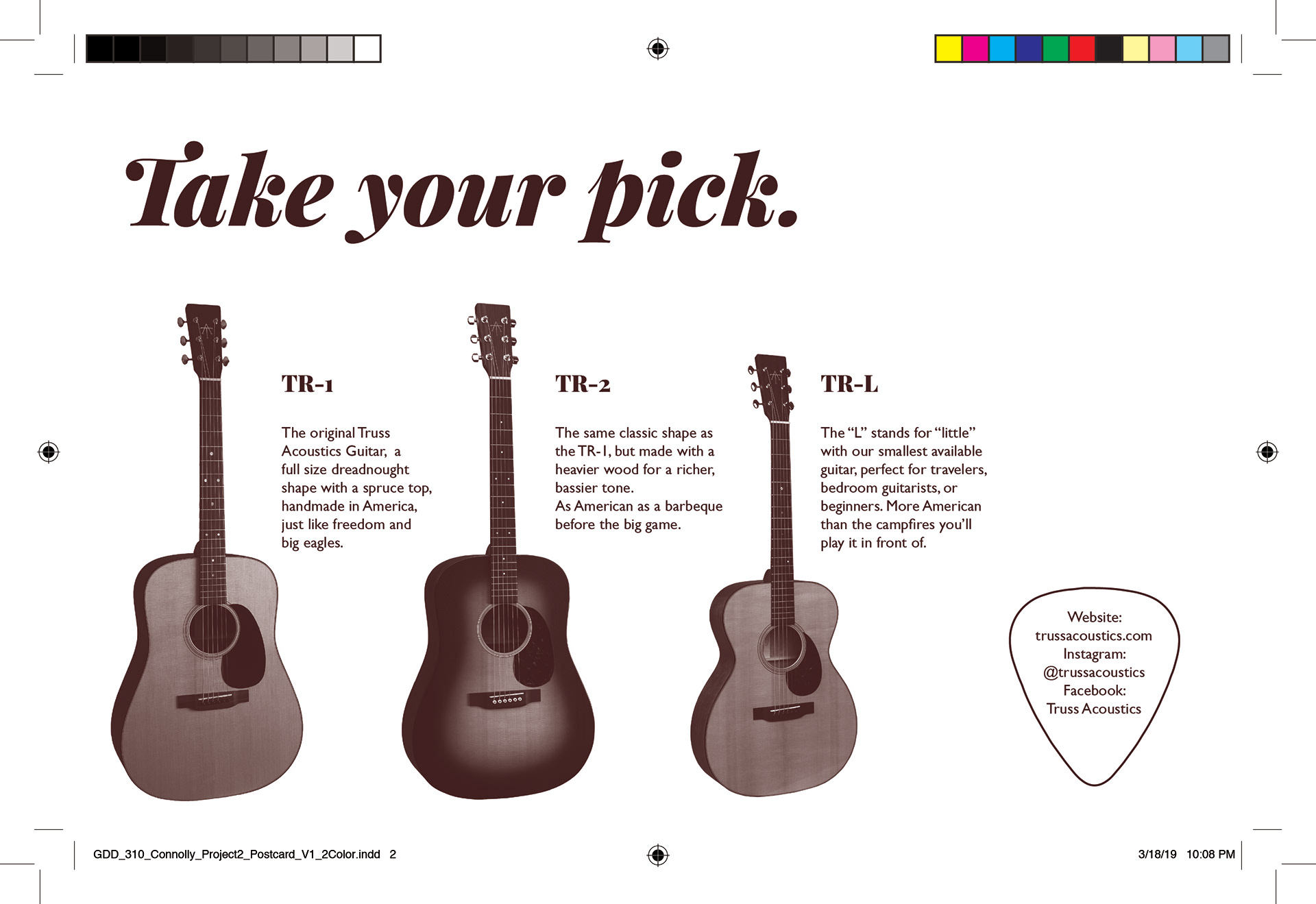
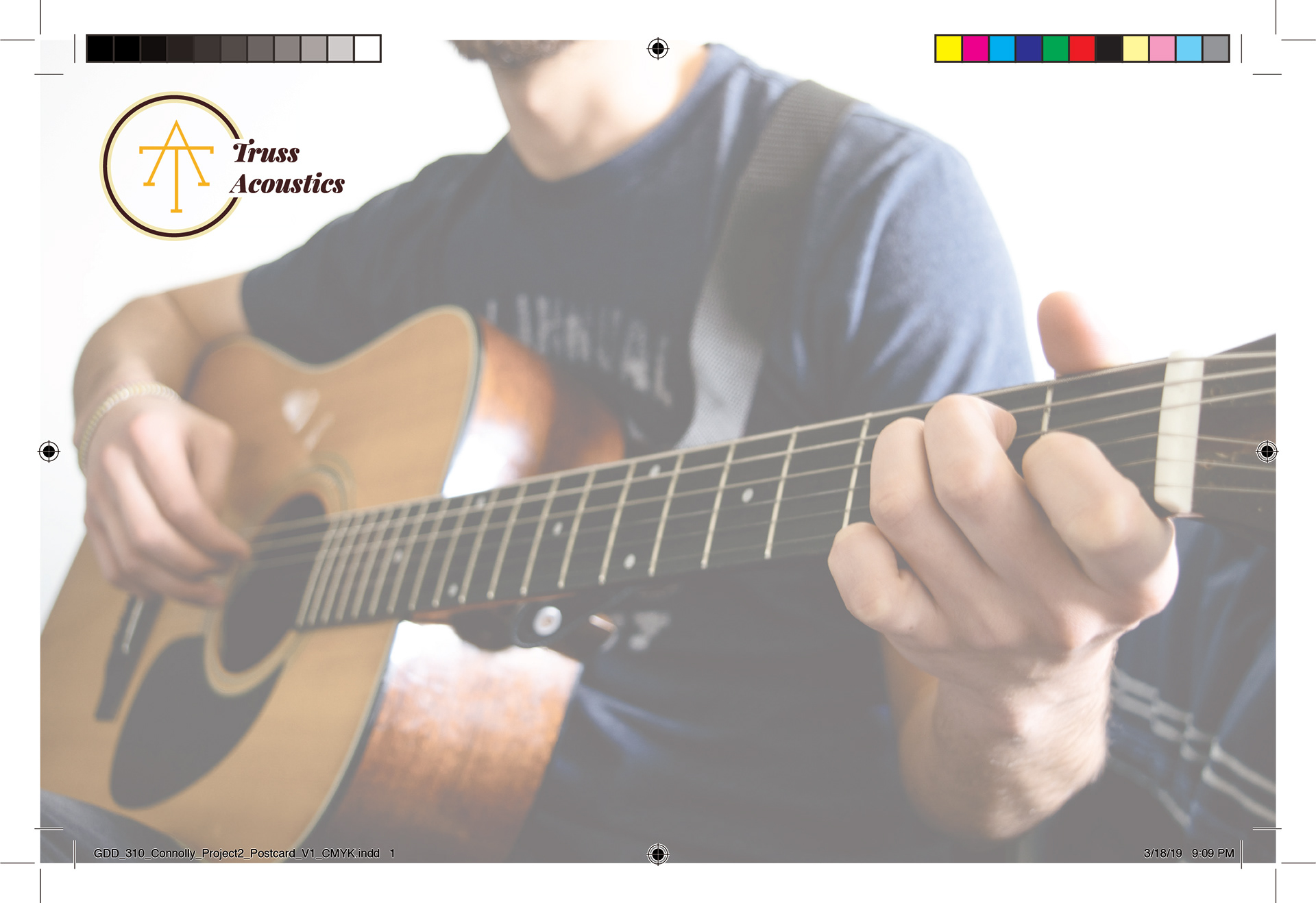
This is the print ready version of a two color postcard I designed for Truss Acoustics. This is a three over two print, with two colors on the front, one on the back, and a spot varnish applied to the guitars on both sides. There is also space for a complimentary guitar pick to be stuck on to the postcard that the customer can keep when the postcard is mailed to them.
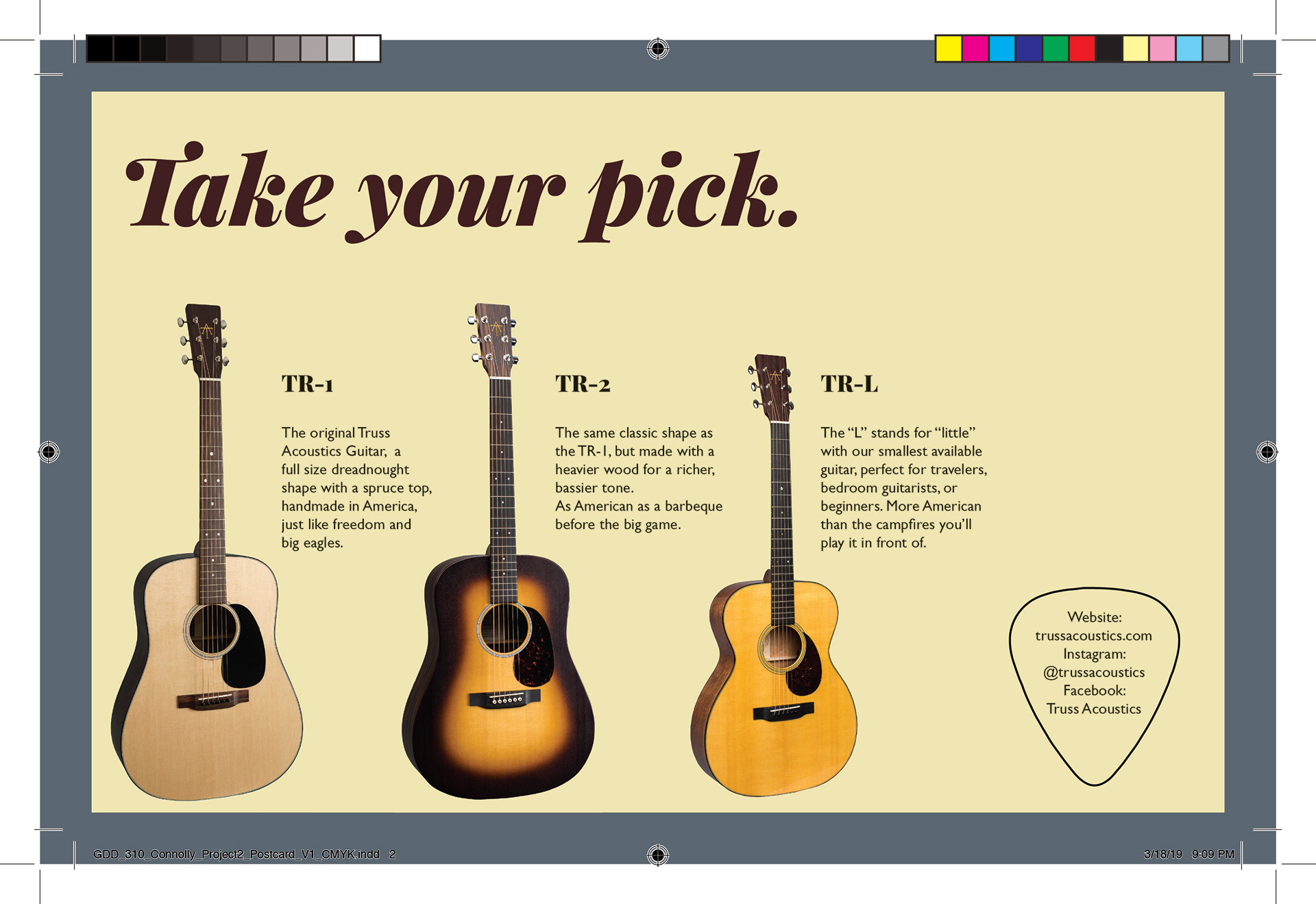
Print ready CMYK version of the same postcard.
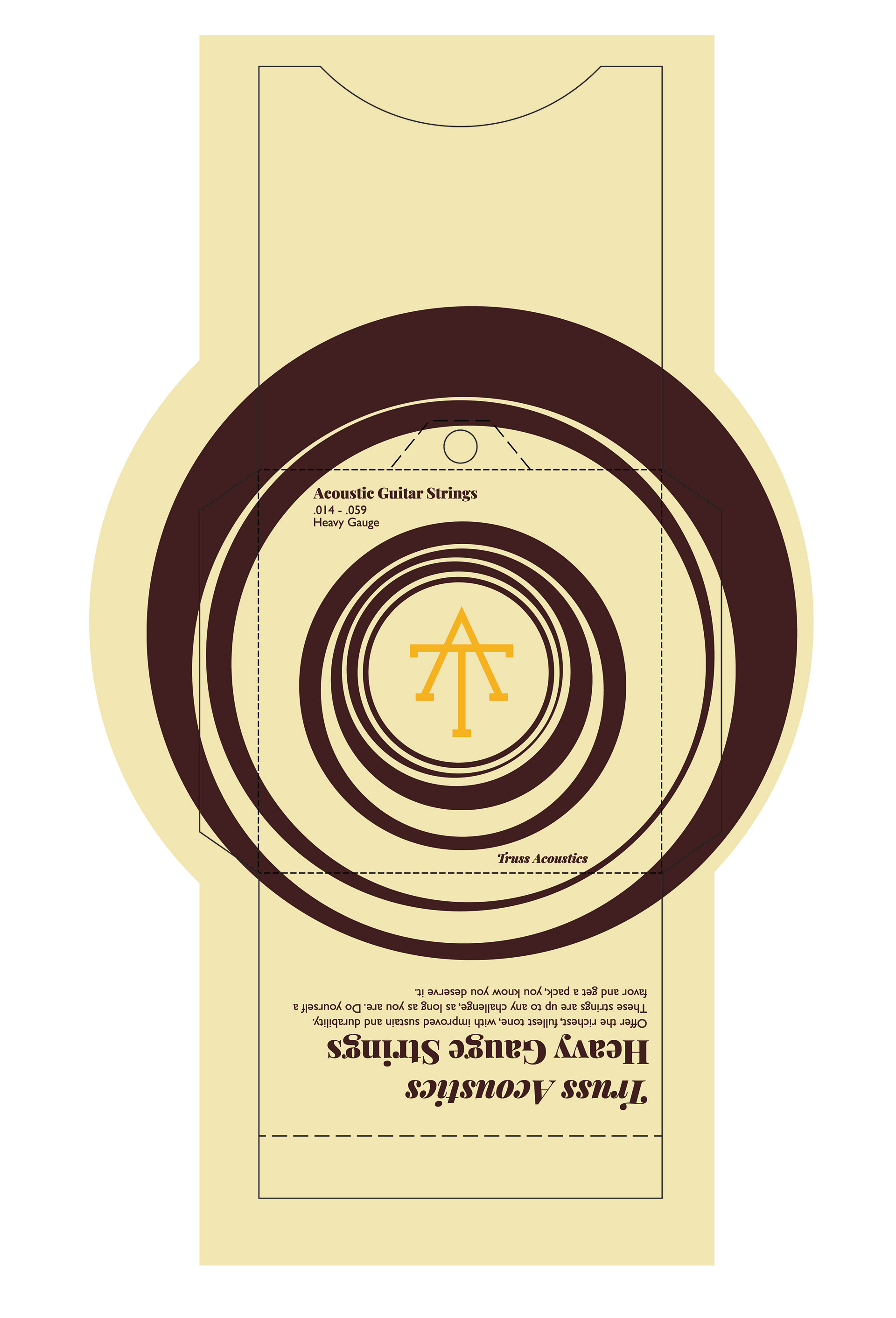
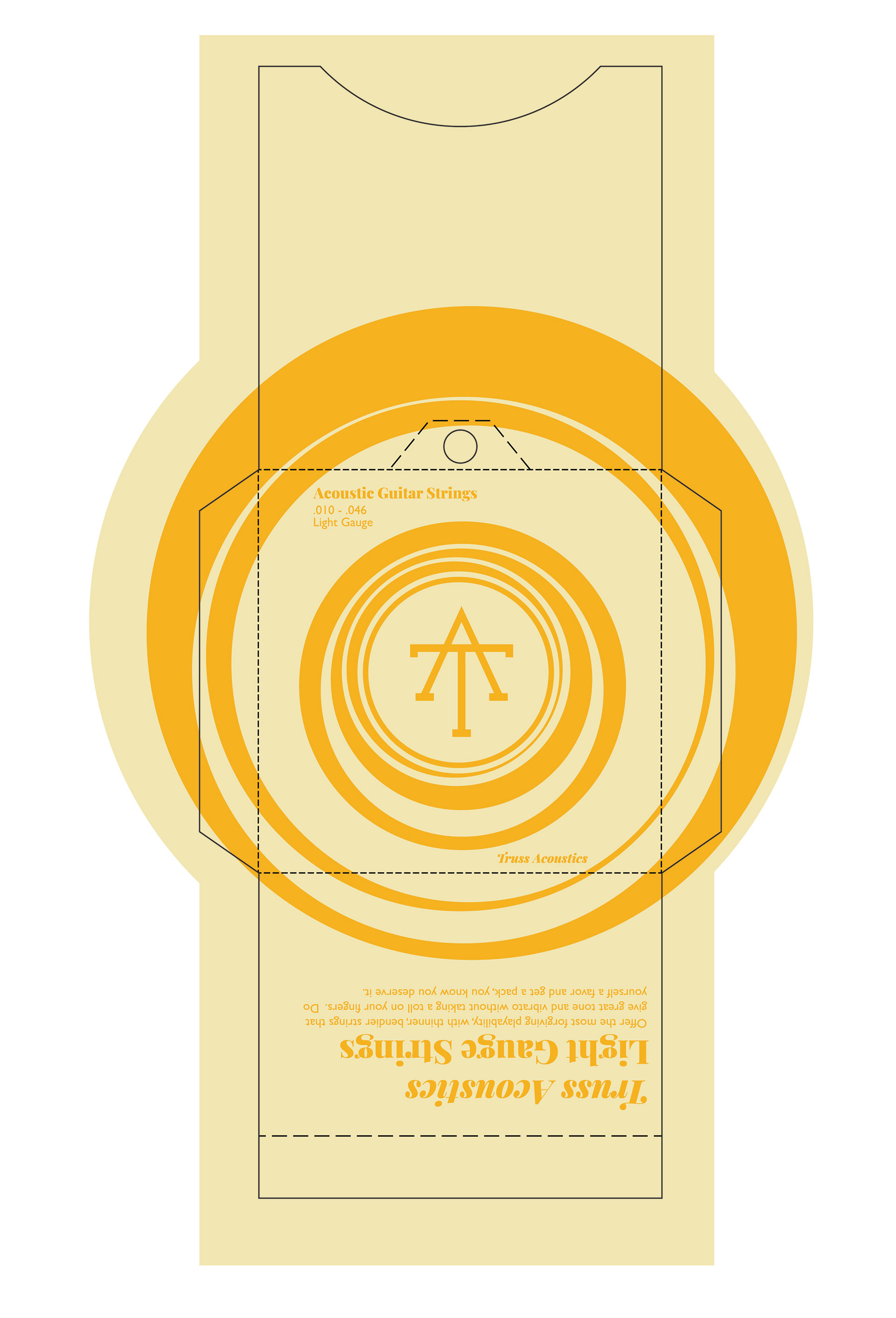
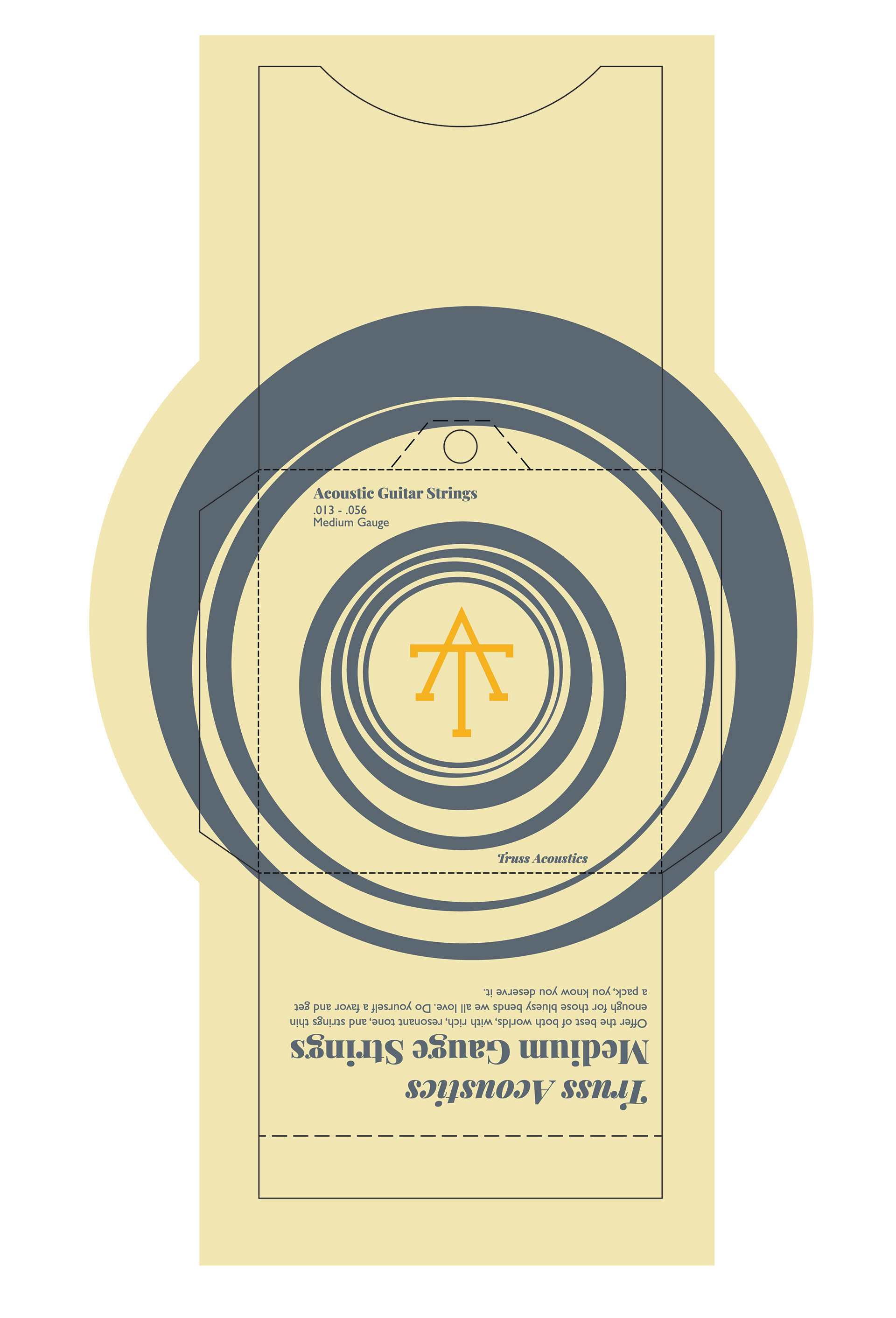
I designed three different two color printable versions of string packaging as well. These would be printed on ivory colored paper, so as to avoid having to print ivory ink on white paper. Each color denotes a different gauge of string, from heavy to medium to light. These files include properly layered die lines and perforation lines, and are ready to be sent to a printer and produced on a mass scale.
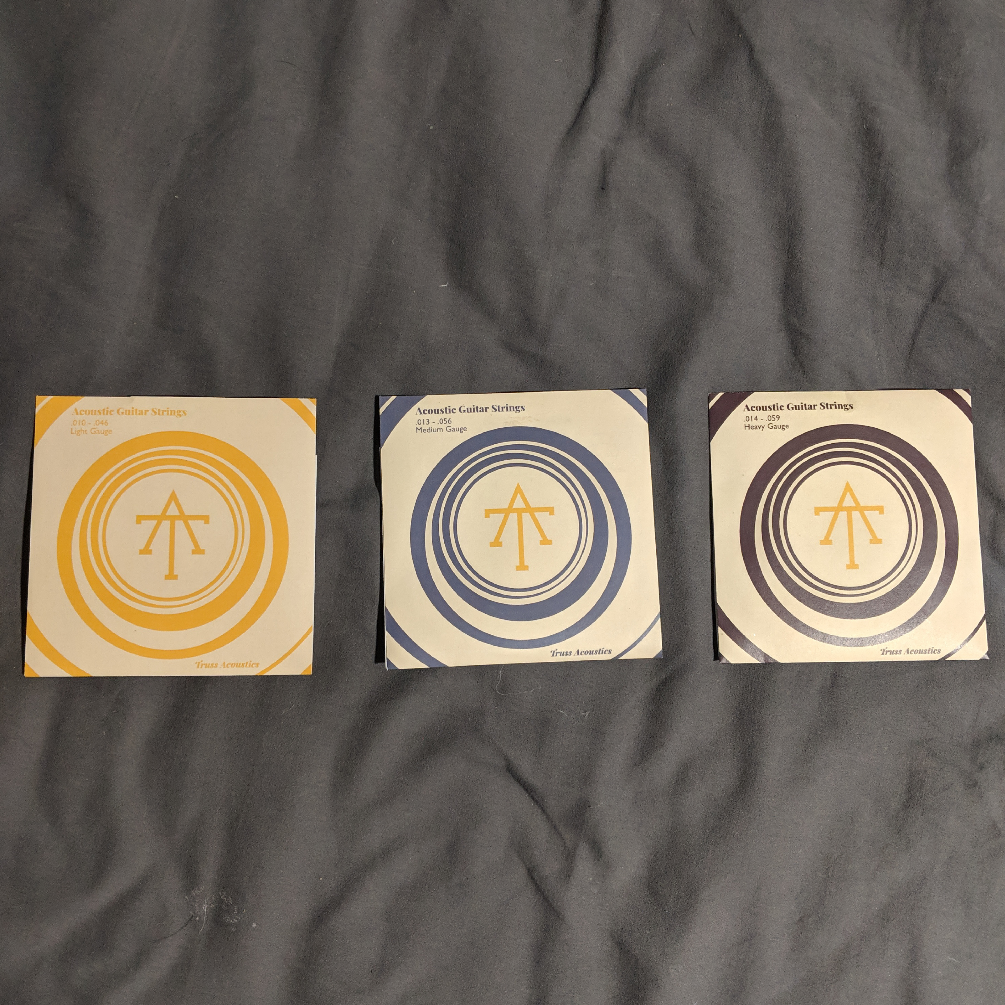
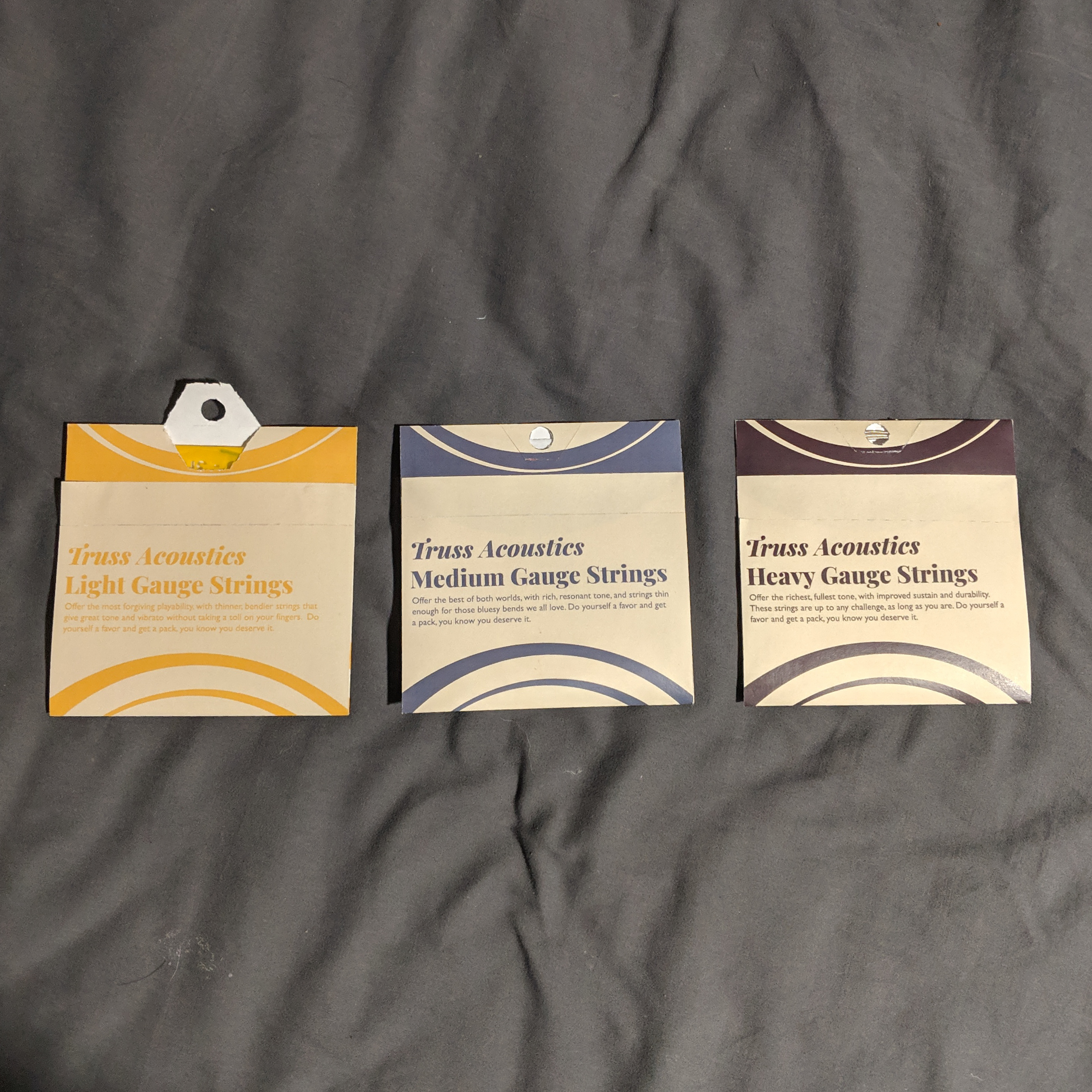
These are printed versions of the string packaging as a proof of concept.
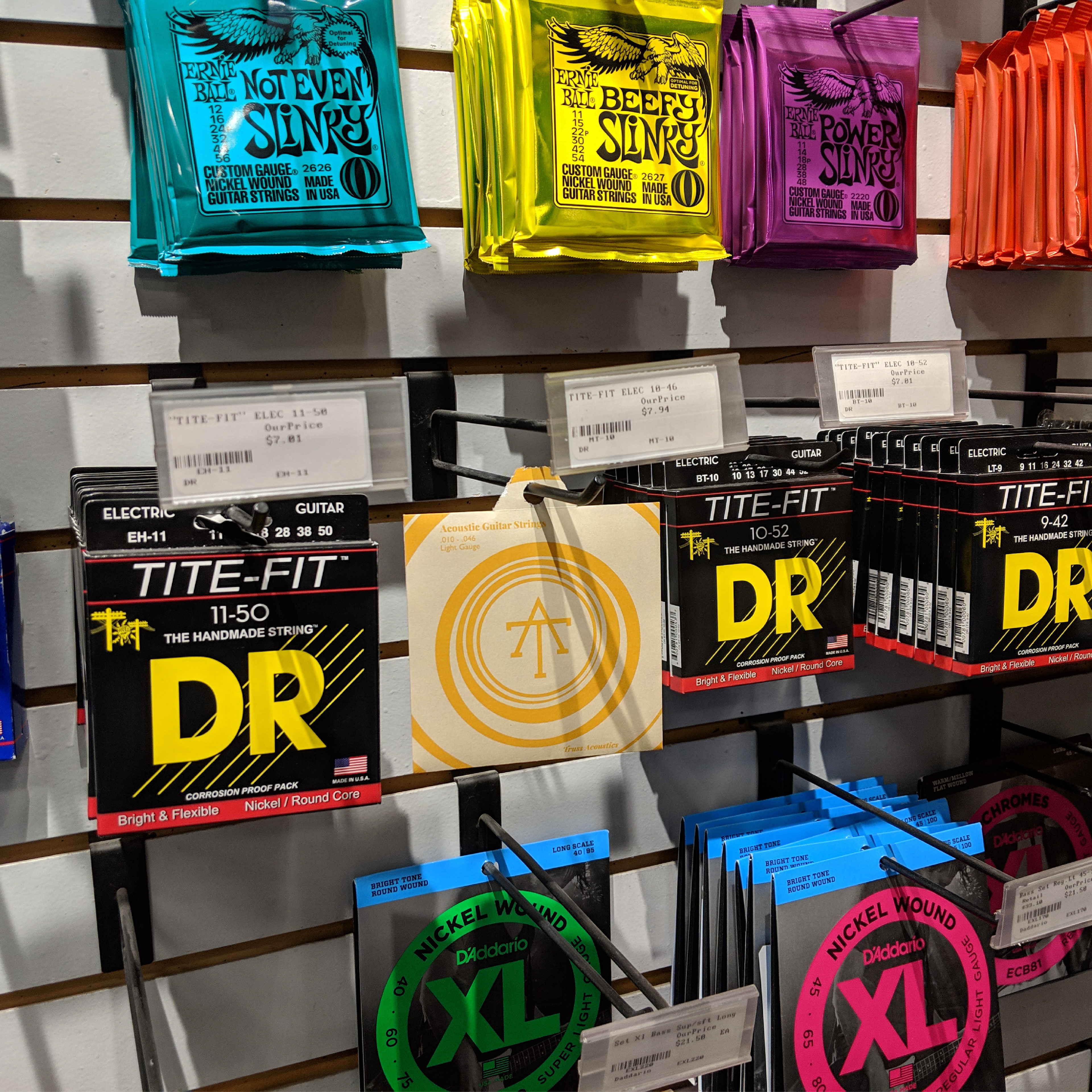
I also went out to a guitar shop and shot environmental photography with the string packaging to showcase how it stands out when compared to the competition.